
Learn how to create a call to action via these 15 tips, based on the most successful practices from all over the Internet.
One cannot simply create a landing page and start selling stuff. Besides having appealing design and revolutionary product/service, you’ve got to have yourself a call to action (CTA). A lot of people miss this very important ingredient and if you’re already here, you’re definitely not one of them. So, let’s get down to business and start from the definition of call to action.
What is Call to Action?
Wikipedia defines call to action as “an instruction to the audience to provoke an immediate response, usually using an imperative verb such as “call now,” “find out more” or “get started.“” Now, remember this key phrase – “to provoke an immediate response using an imperative verb,” because it’s quintessential to grasping the idea of creating an effective CTA. We’re going to refer to it quite a lot in this article.
In other words, a CTA should answer three simple questions users ask themselves whenever they appear on some page on the Internet:
- What is this?
- Why am I here?
- What should I do?
Yes, you got it right. A simple five-six word phrase should answer these three quite complicated questions. And this is what makes creating powerful CTAs so challenging – it’s easier for a camel to go through a needle hole, than for a man to create a simple and appealing CTA. But don’t you worry – there are known and hidden tricks to make it all work nicely, and I’m going to give them all away to you, one by one.
Examples of CTA
Most commonly used calls-to-action include:
- Buy Now!
- Get Now!
- Limited Time Offer!
- Click Here To…!
- Download For Free!
- Register/Sign Up Now!
- But Wait, There’s More…
- Start Free Trial!
… and endless combinations of those above and others. Advertisers and marketers create effective calls-to-action to drive their sales. The ones you should use depend on what you’re selling and your target market/audience.
What are some of the most popular places to feature CTA? Of course, the places where your potential customer meets your product/service upfront. These can be roughly split into several groups, which we call the types of content. This article on types of websites provides a greater insight on the subject.
Website
If your website is essentially a landing page, it’s pretty obvious that you need to use CTAs wherever you ask users to perform some action. However, if you don’t sell something upfront but rather use your website as an entry point for your future customers, you still want to get your message across and point users in the right direction, using CTAs.
Newsletters/Emails
There’s nothing wrong with utilizing email marketing tools to reach out to your clients. Of course, we want our subscribers to be informed of various interesting things, but most importantly, we want them to commit to a purchase. Here, it all comes down to an email, which should contain some value proposition and – guess what – an effective call to action! An incentive would also be nice – something like “get now and receive 50% off” or “sign up today to get a free bonus.” Be generous – it’s all about giving after all, isn’t it?
Blog
Got a cool little blog going on? Great, why not use this blog to convert your readers into customers? Information is No.1 commodity in the 21st century and people are more than ready to pay for the information, if it’s of value to them. Don’t hesitate to add some buttons with CTAs at the end (or even in the middle) of each article to encourage your readers/visitors to perform some required action.
Social Networks
Everyone is on social networks. And if you’re not there yet, go pick up your iStone and create an account at Facebook, will you? Brief and informative calls-to-action are ever crucial to the success of your posts on social networks, so please take some time to consider what you’re going to feature as a headline. Keep in mind that people have like 0.5 sec to decide whether they should read into your post.
How to Measure the Effectiveness of CTAs
It’s a good thing to know which call to action works better. And not just “better,” but exactly how much money it brings to the table. Typically, you would measure the effectiveness in percent by applying a simple formula:

The ratio is called click-through rate (CTR) and this is something you want to keep on checking from time to time and constantly improve until it reaches 100%. If you don’t have a button to click on, you can choose whatever target action you require from users instead of “clicks” (sign up, leave an email, upload/download something etc). The higher CTR, the better for your business.
15 tips How to Create a Call to Action
Now, the main course – practical tips and recommendations you can use for your website, mailing list, blog, or social media account starting today. Kicking it off from…
Tip 1. Use ACTION in CALL TO ACTION

This might seem quite obvious, but apparently it’s still not for many marketers, who keep producing the same weird buttons with calls-to-action like “Our newsletter,” “Free Trial” or “Free Sample Available” over and over again. What are they supposed to mean anyway?
If you want your visitors to perform some action (provoke an immediate response), use an imperative verb. Remember? In other words, if you want people to do something, just ask them to do it. It’s as simple as that.
First of all, define what the target action would be: anything from signing up to purchasing. Then, start your call to action with that very word. Bam! It’s done. Getting back to our unfortunate examples – here’s what they should’ve looked like in the first place: “Sign up for our newsletter,” “Start Free Trial,” “Get Free Sample.”
Tip 2. Be Brief
Less is more, you know. People don’t want to waste their time and efforts trying to decipher your hidden message. Speak their own language and reap the rewards. An effective call to action rarely contains more than 5-6 words.
Also, you may want to consider dropping unnecessary articles and other fancy grammar stuff. It’s all about getting the message across, so don’t go PhD on those poor people, many of which are not even native speakers of English language.
Compare these two examples:
Get A Free Sample Of The Product– grammatically correct, but marketing-wise it’s a flop;
Get FREE Product Sample – now that’s much better and easier to read.
Tip 3. Size Matters
Whatever your call to action is, make it VISIBLE and NOTICEABLE. Common practices include capitalizing important words (or even the whole phrase), putting greater visual emphasis on the button itself, and basically making your call to action bigger compared to other UI elements.
Again, if you want to get noticed, don’t stutter and stumble. Go ahead and put a big button with a readable message right upfront on your page. Yet, have mercy on those who are on your website just to browse through stuff and try not to ruin their faith in humanity by creating oversized monsters. Be gentle, yet insistent. To quote the great Steve Jobs, make the buttons on the screen look so good people will want to lick them.
Tip 4. Choose Colors Wisely
Not all colors do the job of converting visitors into customers the same. It has been scientifically proven that different colors evoke different emotions in people. It’s not something that we realize with our mind when we open up a web page – more on a subconscious level. Yet, it’s still there and you should definitely employ this tactics when considering a color for your call to action.
Here’s what basic colors mean:
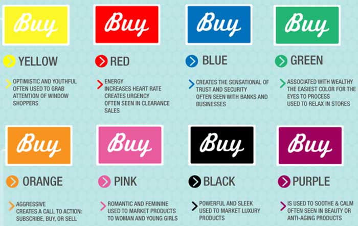
If you’re interested, here’s a great article on the subject.
Tip 5. Use MY Instead of YOUR
Generally, I refer to the usage of 1st person speech instead of second. Many popular case studies (including this one, taken from Unbounce.com) suggest that simple changing of YOUR to MY in a typical call to action like “Start Free Trial” or “Get Free Bonus” can get you up to 90% increase in CTR.
It’s a no-brainer, so just take a quick note and let’s move on.
Tip 6. Create a Sense of Urgency
Who hasn’t talked about this before? Even Jordan Belfort, the ill-fated Wall Street broker and the main protagonist of the movie “The Wolf of Wall Street,” suggested that creating a sense of urgency was one of the major sales techniques. And he surely knows his stuff, doesn’t he?
Anyways, where were we? Creating a sense of urgency implies that something is only going to available for a limited period of time and/or in limited quantity. People are naturally inclined to go after such things first. Sometimes, not even needing them, really. Sigh.
To create an effective call to action, use words and phrases like “Sign up and get 50% off today only,” “Buy now to get exclusive DLC” or simply “Start your free trial NOW!” Play around with those first and see if you can get more creative and come up with something really impressive for your visitors.
Tip 7. Keep It Above the Fold
Needless to say, any call to action is there to be read and understood. There’s no use in a call to action that’s hiding below the fold, and by that I mean that if your visitor has to scroll the page to see your CTA, then it’s no good.
So many up-and-coming websites violate this rule that it’s not even funny anymore. If you have 2 or more pages on your landing page, prepare that at least 50% will never scroll down to view the second page. Just make sure all your calls-to-action are above the fold – they’re better off this way, trust me.
Tip 8. Be Creative with Your Copy

If you have a landing page that promotes a product or a service, that’s not enough to make money. Everyone has a landing page nowadays, even my grandma. What makes your landing page special? Think about it, cause that might one thing that will put you above your competitors.
In order to stand out in the world of generic “Start Free Trial” and “Sign up for our newsletter” calls to actions, try to be more creative. Evoke curiosity and amazement in people.
For example, would you click on a button that says “Learn how to earn $1,000 a day”? Even if you suspect this is a scam, you would still have a hard time resisting clicking on that button, wouldn’t you? Because that’s what makes us humans human – emotions! Be emotional and evoke positive emotions with your calls-to-action in other people, and you’ll be rewarded.
If you need more information on how to write a great copy (and I know you do), you’ve got to read this article – “What is Content Marketing: Guide to Successful Content Strategy“.
Tip 9. Don’t Be Afraid of Fancy Graphics
Who said that buttons should always be rectangular and green? A big red round button may do the job even better! Weird shapes and sizes? Flashing colors? Animated? Anything goes as long as it’s legal 🙂
Here, it’s all about trial and error. Keep on experimenting until you find what’s best for you. Remember one thing – people always tend to notice something that is out of the ordinary, even if they tell you otherwise. But do not overreact though, people are sensible creatures after all – they might get insulted by your lack of common sense and style.
Tip 10. Employ Benefit-Oriented CTAs
Remember the questions we talked about back in the starting paragraph? These are the questions most users ask themselves when they open up your landing page:
- What is this?
- Why am I here?
- What should I do?
Optionally, you could add a fourth question – “why should I do it?” And that’s a very important question many people tend to overlook. Take it from a user’s perspective, “OK, I may start this free trial. But what do I get? Why do I need it? I’ve managed to survive up until this moment without this product/service, so why should I even consider it?”
Adding an incentive or benefit or value that user might get by completing your CTA may greatly increase the CTR – many companies have already tried it and all report the positive effect of such benefit-oriented call to action.
For example, an e-shop could’ve created something like “Sign up to shop online now.” You get the idea.
Tip 11. One Big Fat CTA Is Better Than 5 Small Ones

How many times has it been scientifically proven that the necessity to choose from many options drives people into depression? Our brain simply cannot handle that many choices.
Give your visitors a break – leave them with one nice and clear call to action instead of creating multiple CTAs. More buttons has never meant more clicks.
Tip 12. One Call to Action Per Page
Whenever you have a certain user flow going on for your website, consider using different calls to action for each step of such user flow (for example, signup process, or purchase).
If you still have to have both CTAs on the same page (for example, LEARN MORE and SIGN UP), prioritize the one that’s more important to you (LEARN MORE, in this case) by making it brighter, more colorful, and noticeable.
Tip 13. Consider Typical User Flow
What I mean by user flow here is that, for example, people in the Western world mostly read from left to right, moving down as they go. Therefore, you want to position your call to action on the page in such way that would be easy and natural for a typical user.
There’s a cool test that is designed to see how well users can comprehend what’s on your page and get the main idea. It goes like this: find a random person (who’s unfamiliar with your page) and show him/her the page for just 5 seconds, not more. Then ask the person how much information he/she got from the page and what was the call to action.
Seriously, try it – you’ll be surprised with the results.
Tip 14. Leave a Lot of Space For Your CTA
Quite obvious here – you don’t want to place your call to action inside some large chunk of text or between the images. Leave enough space for the call to action to be visible and noticeable.
Sometimes you may want to place some additional explanatory text right under the button, but that’s it pretty much it. Anything more than that will probably bury your button under the content.
Tip 15 – the Final and the Most Important One. Do a Lot of A/B Testing. Then Come Back and Do Some More.
How can you really know which call to action is better? Right, you cannot. You can only guess.
Your visitors, on the other hand, know and they show it every time they complete (or do not complete) your call to action.
If you want to do it right and achieve serious results, do yourself a favor – perform as many A/B tests as possible. There are many tools out there, like Google Analytics, Mixpanel and others. Choose any of them and start testing!
Conclusion
So, these were the 15 tips to help you understand how to create a call to action. Hope you find them helpful and use some (or all) of these tips in your everyday business activity. Don’t forget to thank me when you become a millionaire!
The right thing to do would be share this article with your friends on the social networks – just click on one of the icons of social media, it’s that easy.
If you have further questions on the subject, please write them in comments – I’ll be glad to answer.


Comments0